-
Architects: DIKA DESIGN
- Area: 9000 m²
- Year: 2019
-
Photographs:Bowen Hou
.jpg?1585236265)
Text description provided by the architects. Time is from 2017 to 2019. This review always brings some sense of ritual. This unique shape is like a lollipop. It is located in Yunnan. The lollipop ideal garden has a different history from other works. It redefines the architecture. As a vehicle for the teaching and cultural background of the school, half a year after the initial design was completed, the building began to be built in a location completely different from the original design environment.

Haihua Eaton International Kindergarten is located in Yunnan. The Honghe Hani and Yi Autonomous Prefecture, Mengzi City, Shanghai Road, is located in the core area of the city center of Weinan. The project covers an area of 16 mu. The complex is centered around the city and is covered by the city. The project was completed in late 2018. When put into use, the building effectively captures the local cultural identity and has a unique recognition.

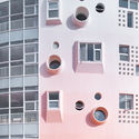
The biggest difference between this kindergarten and other kindergartens is that all the inspiration in his design comes from the children's art world. The most prominent feature is the design of the external shape. The key is the carrier and the main body is also shaped like a lollipop. Just like the children's paintings, add more to the natural and childlike fantasy. The external appearance also removes the children's strangeness and suspicion about the school. Reducing the icy feeling of reinforced concrete, after constantly experiencing design, modification, adjustment, scrutiny, and repeated innovation, the designer gave his life with a stroke and created the most “familiar freshness".

The color of the campus borrows the color of the sky gradient at dawn, from bottom to top, from deep to shallow, full of mystery and transforming infinite atmosphere, color can bring different feelings and emotions to children, while gradient color can give Children have more imagination space, pure gradient color makes the color more vivid and gentle, not monotonous and will not burden the vision. Designers are also trying to create a poetic and artistic world, giving children a strange world. Let them experience, grow and feel the four seasons here.


Every region of the school has its own function. Thanks to the natural conditions of talent, at the beginning of the concept, the architect tries to create a campus that can blend with nature, with the rise of the morning sun, the gradient The facade of the wall, the sun hits the ground and the wall, forming a pleasant path. Under the sun, the air and the water are all accompanied by the breeze. The children have a complete connection with the children. The children breathe fresh. The air, while feeling the harmony of nature, walks through it and brings an extraordinary experience.


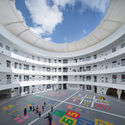
The outdoor activity area brings interesting collisions—the contrast between concrete and color has reached a harmonious unity and a collision between new and old. The outdoor activity area is the main daily activity area for children. We also try to explore more space. Possibility, the designer hopes that this area is more open and flexible, to meet the needs of students of different ages. When the sun travels, the interesting path becomes a fun light and shadow game. It is these small details that make the campus look so special. This area is widely praised and loved by parents and children.

The exterior white concrete makes the building seem to wear white feathers, making you seem to enter the Pandora's box, with the power of the world.


The design team preserved the building structure of the Fujian Tulou Building and the Hani Mushroom House, blending traditional cultural elements with modern architecture and incorporating local art. The designer uses the simple architectural language to express unadorned architectural connotations. Incorporating modern design techniques into this traditional body, it creates a texture with ethnic characteristics, leaving children with a unique and modern architectural work, and better adapted to the lifestyle of local children.

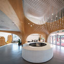
The atrium space increases the fluency and mobility of the building. The interior space is dominated by white. The ground is dominated by color and has an active atmosphere. The atrium space is the most important place for children to interact. The ring path is simple and unified. Children can run in the bright and smooth atrium, and they can let the children use the space more freely.


.jpg?1585236265)


.jpg?1585236719)


